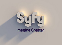
 The SCI FI Channel has changed its branding. Check it out with this link.
At On-Purpose Business Advisors we inevitably end up in branding because of our core work on business design and strategy. Branding is one of the first external expressions and places to create alignment with customers.
I had to laugh when I saw the new name. SCI FI says it all. Syfy – what does that say? There are  some names you just don't need to change. That said, a logo update would certainly be in order, but to change the name at this point to Syfy is just plain stupid. Perhaps they have some magic hidden up their sleeve with this new name. I sense someone got paid a great deal of money to develop a new look and name. Unfortunately, the emperor's new clothes made it through tight-lipped committee after committee for approval.
The new logo makes me think this is a Styrofoam cup business, a paper company, or a pharmaceutical conglomerate with some made up name due to some chemical compounding. Certainly not an edgy science fiction television channel.
The good news is the execution on the web site is stunningly well done in terms of navigation, look, graphics, etc. They've kept the traditional purple (outer space?) for highlights. There is a lot there and they manage it nicely. So kudos to the team that took what was probably given to them and took it boldly where few have gone before.
For now, all I can do is sigh, fyi.
Be On-Purpose!
Kevin